I know I say this a lot, but I really do have the most amazing clients. From the the word “go” this sweet family was working around a baby who wanted to come early, building a new home, two little girls needing step one of education and a world pandemic.
Mike and the Kidlets
Mike treats all his clients as if they are family. After all, it’s their money, their time, and their livelihood that he’s dealing with. He’s available around the clock and does whatever it takes to get the job done. Mike is the type of broker that will put on his work boots and head lamp to go in the crawl space for you, even if it’s littered with mice. He’s a unique breed of real estate agent and he’s a talented general contractor to boot.
This created an especially unique stack of challenges; creating an online vision that showcases Mike’s working style, highlights his extensive skill set and connecting it all with his talent in real estate as well. His wife Nicole is his marketing manager, house and business manager and an incredibly talented writer.
We started with a logo design that was clean and fresh with a strong and elegant bent. Working in strictly black and white, focusing on a design that was elegant enough to sell million dollar homes, but strong enough that no one would be surprised when Mike hops up on the roof to check out the gutters.
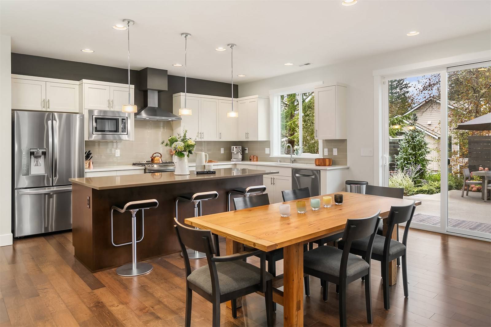
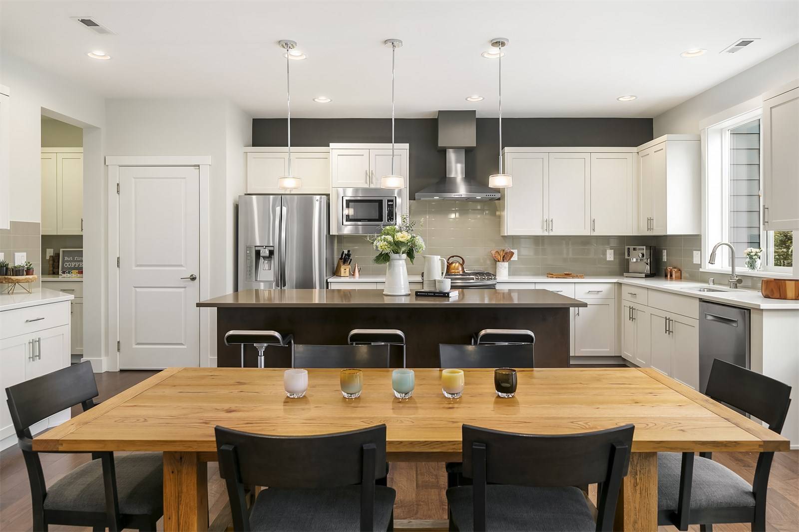
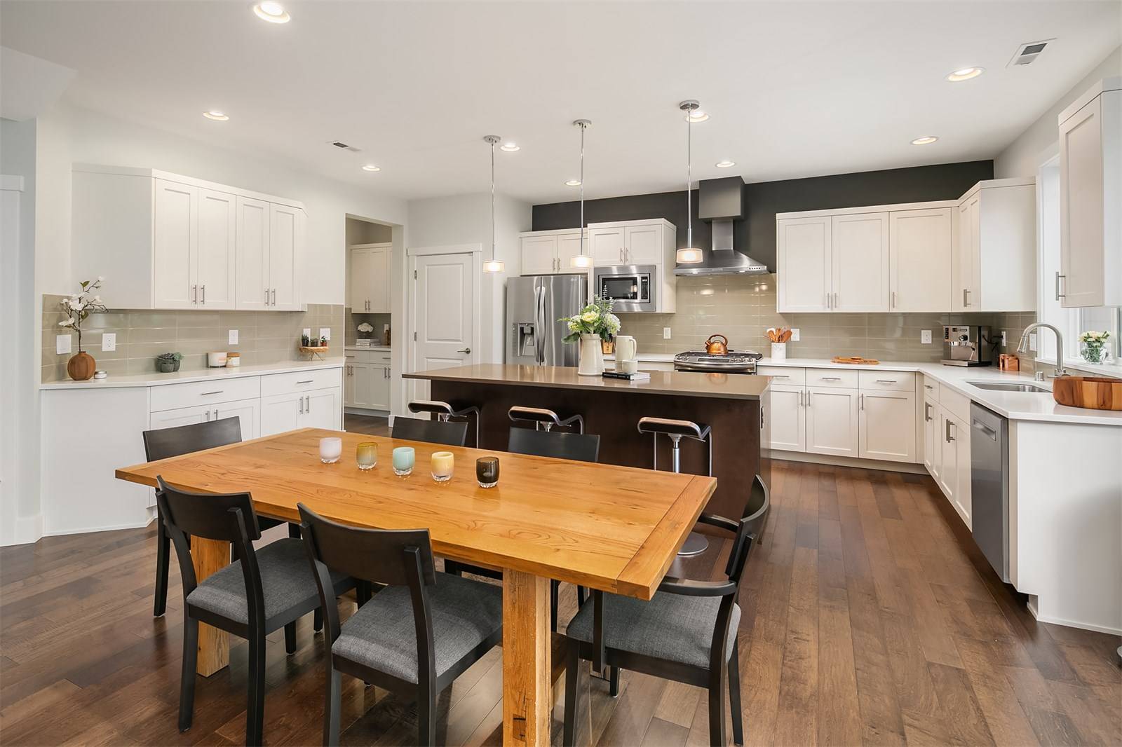
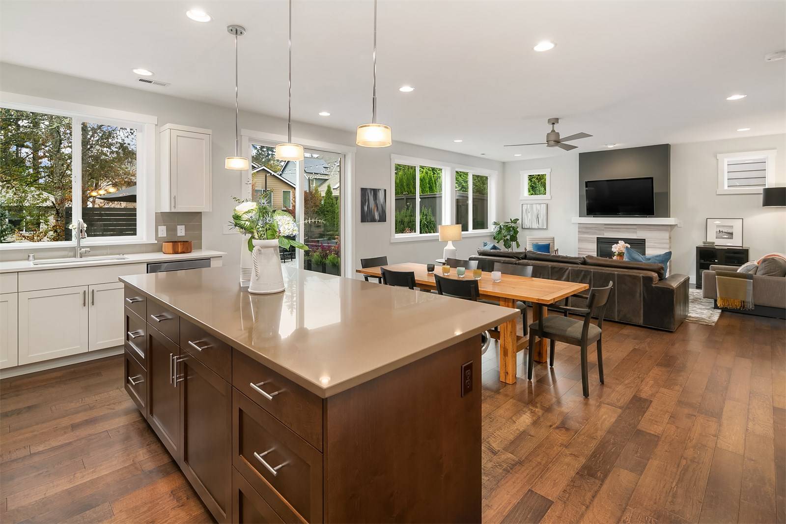
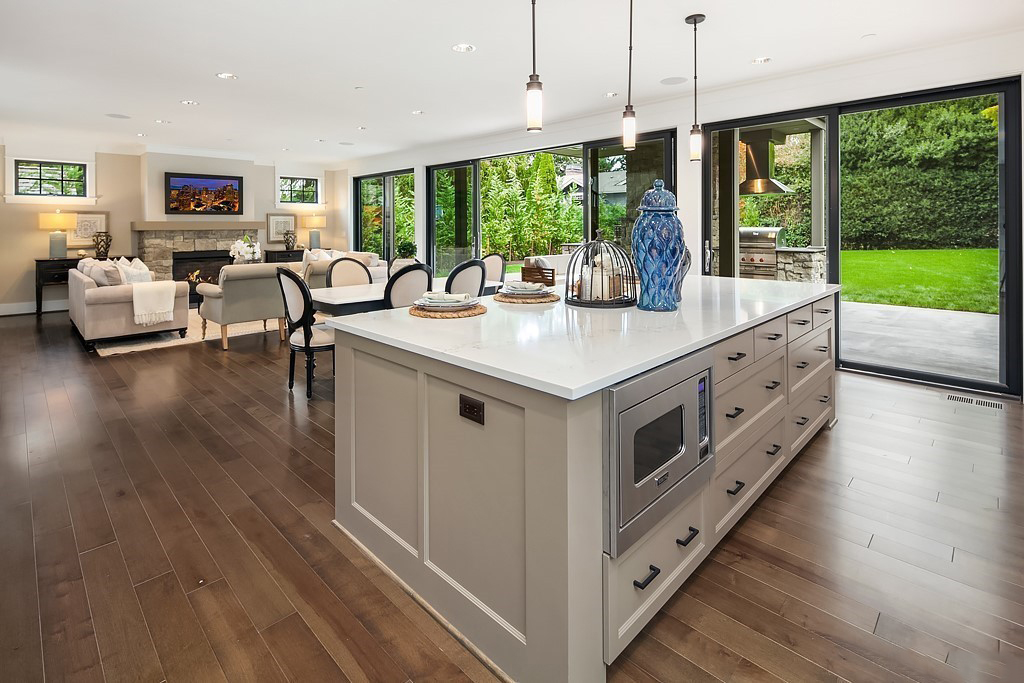
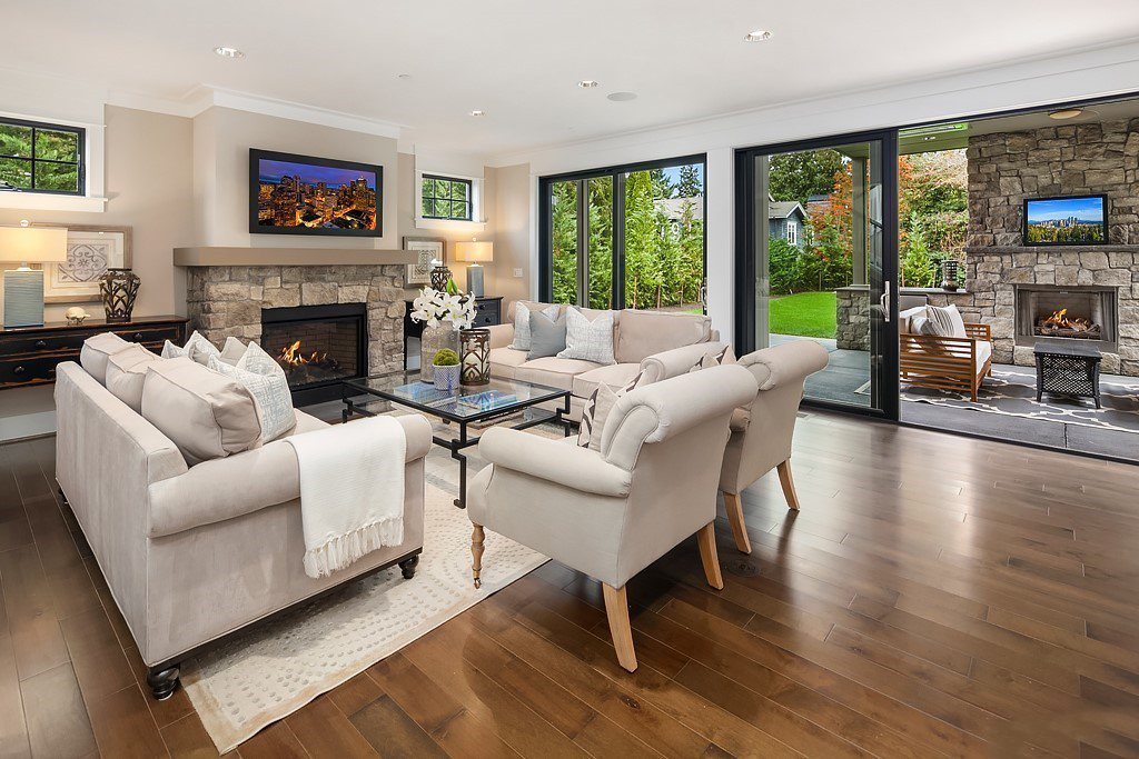
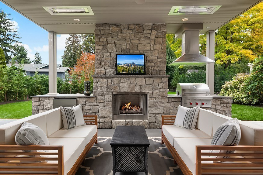
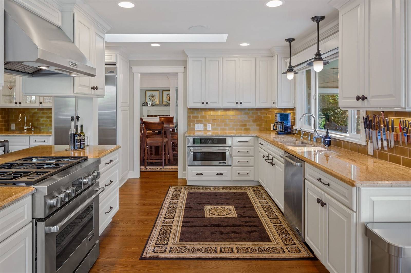
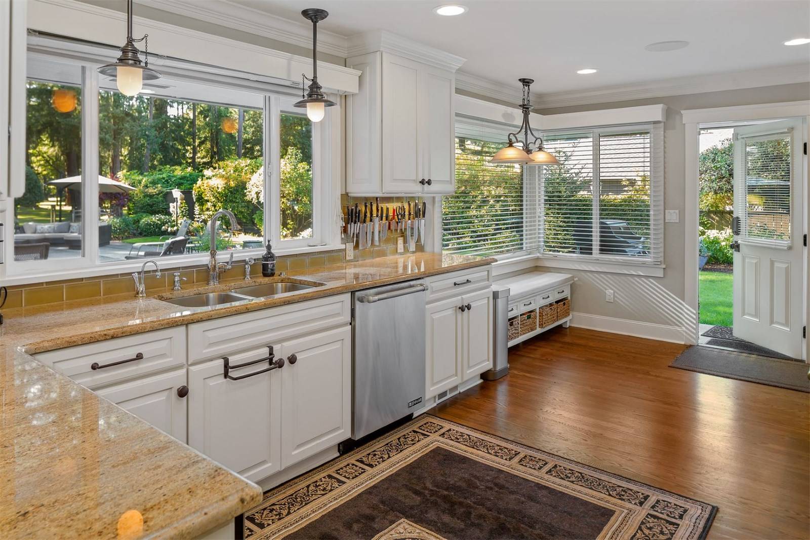
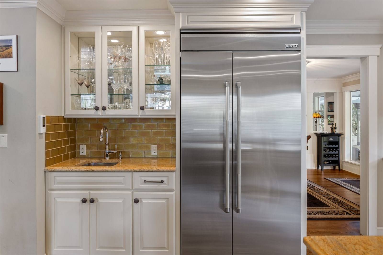
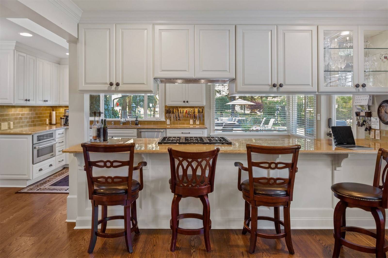
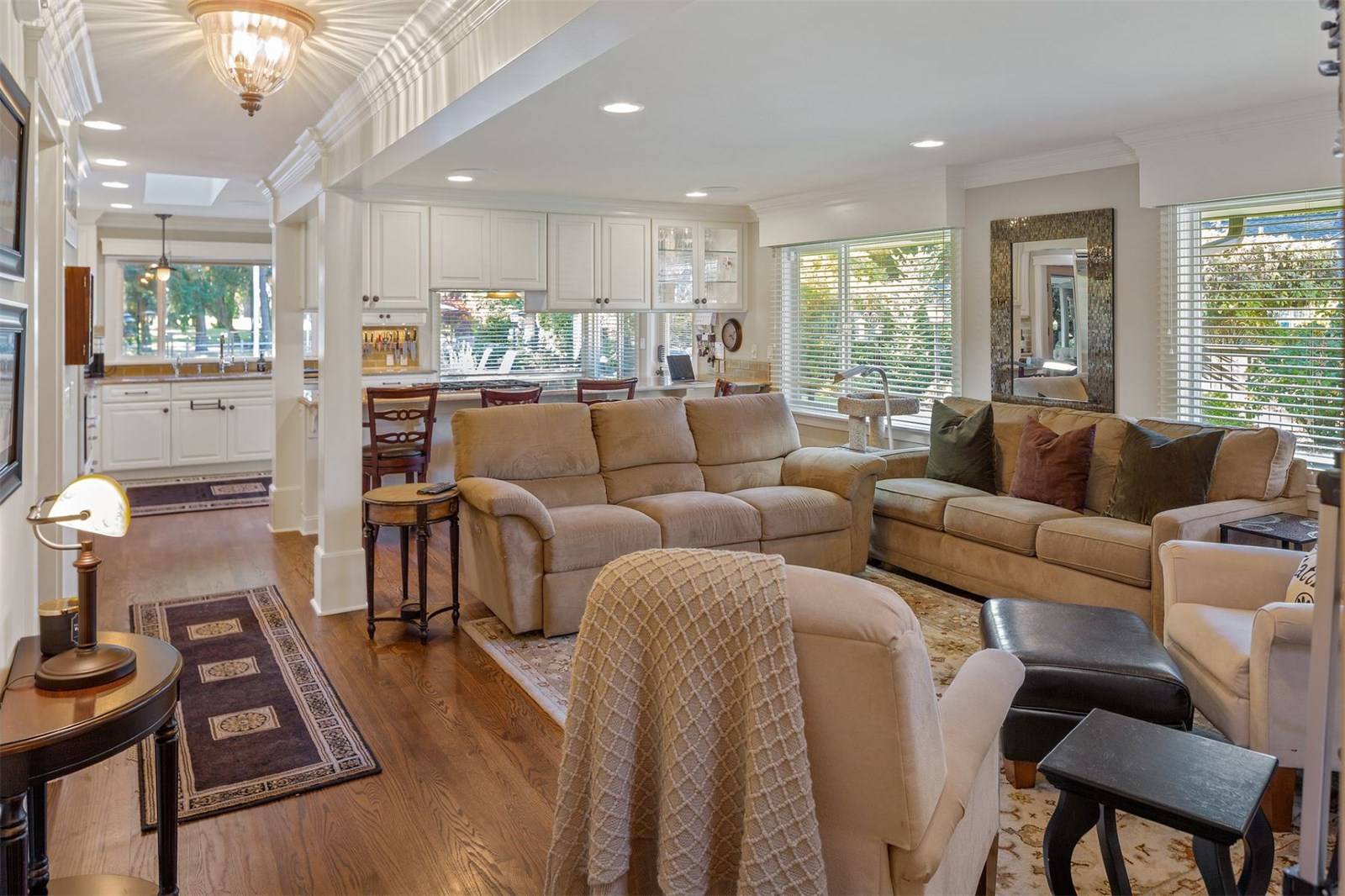
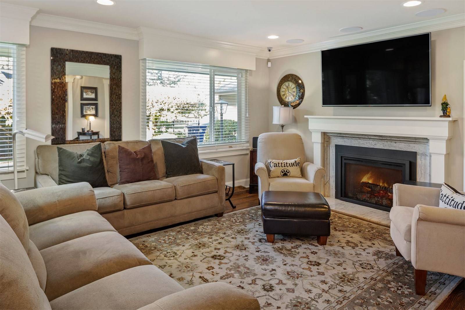
Nicole partnered closely with me to create a website that was a useful space for their clients, offering a myriad of data in a clean, friendly way. From general contracting to painting to finding a home buyer for their new listing to connecting home sellers to buyers that fall in love with their home or property, the McRae Homes website is curated to showcase their mad skill set.


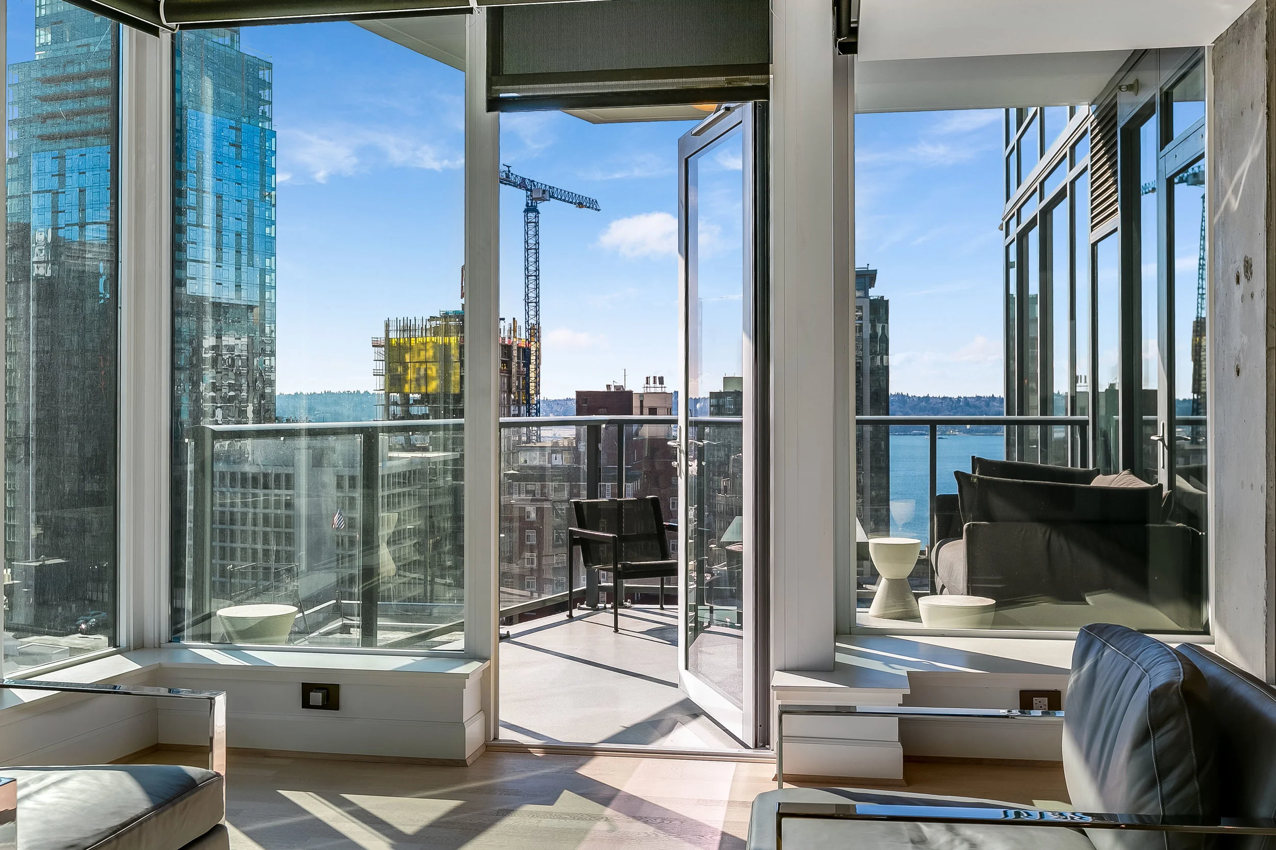


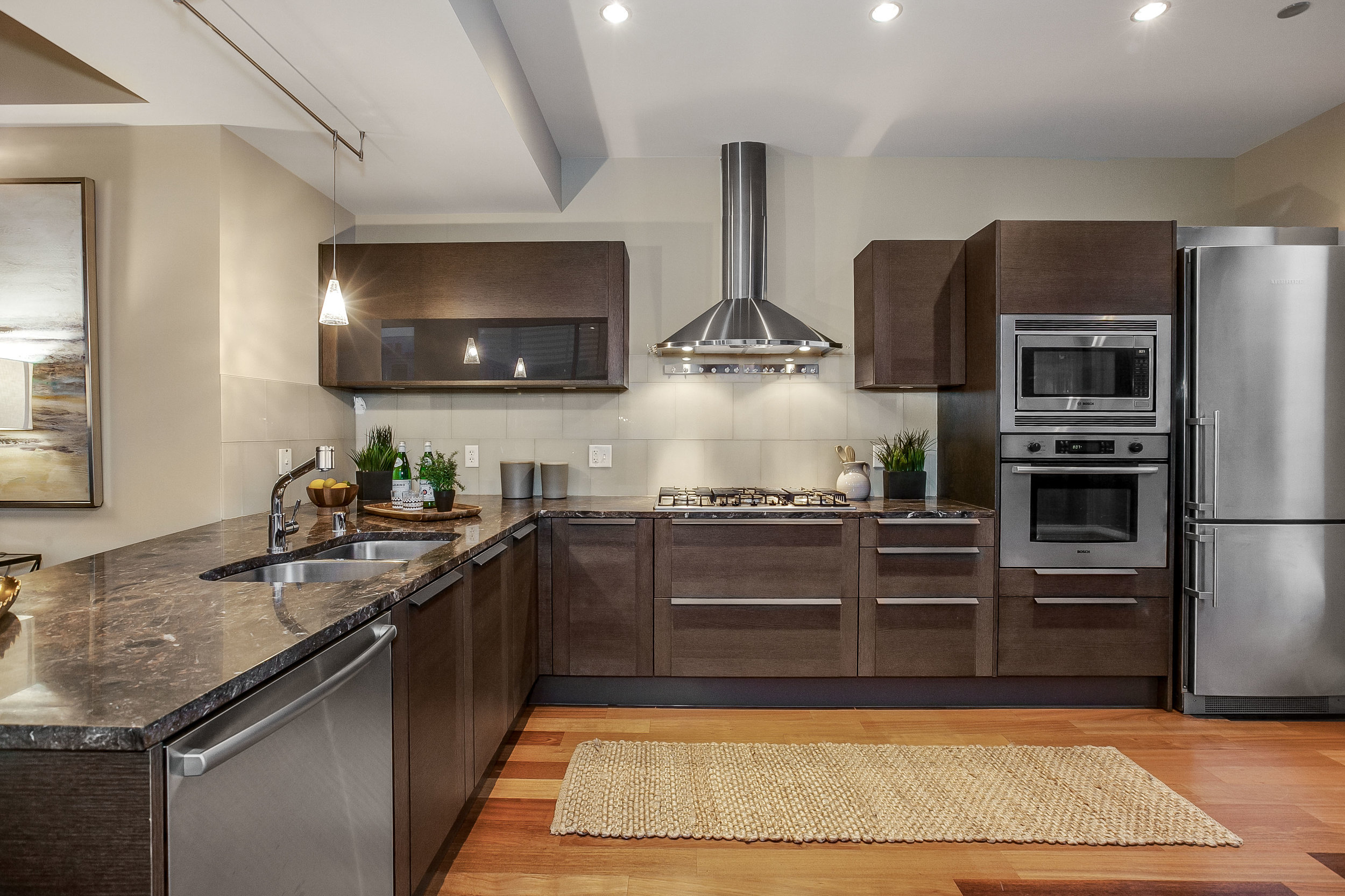
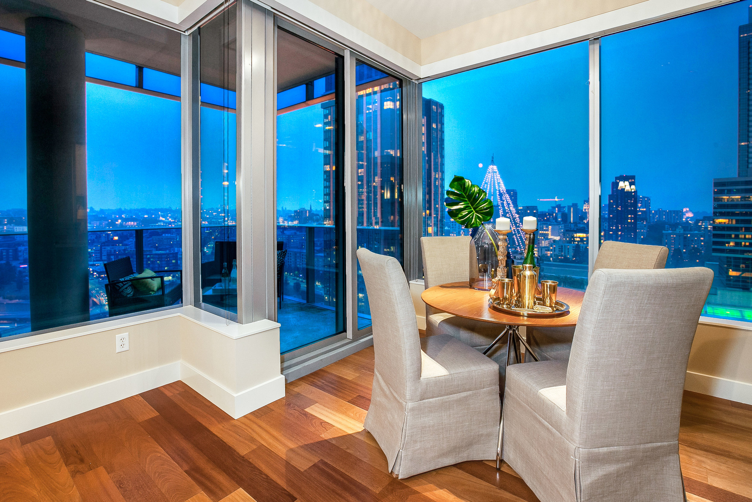
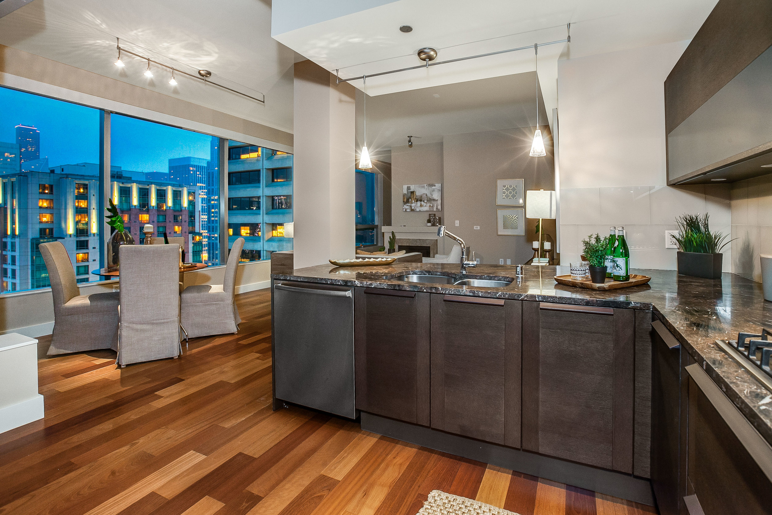
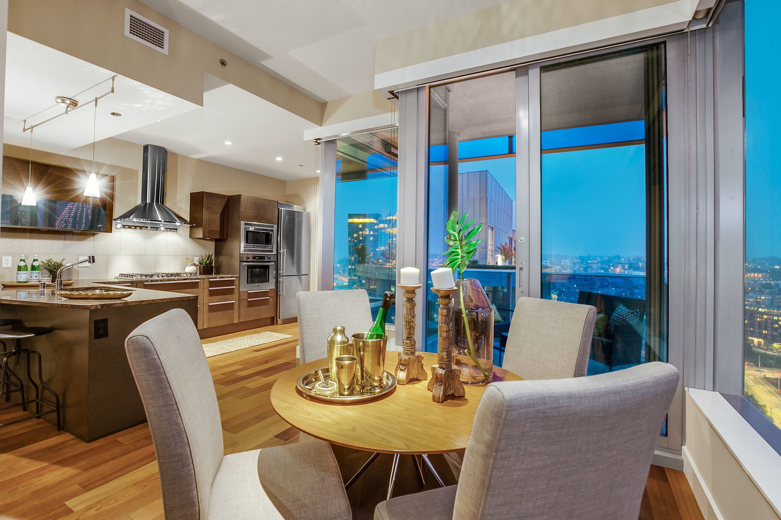
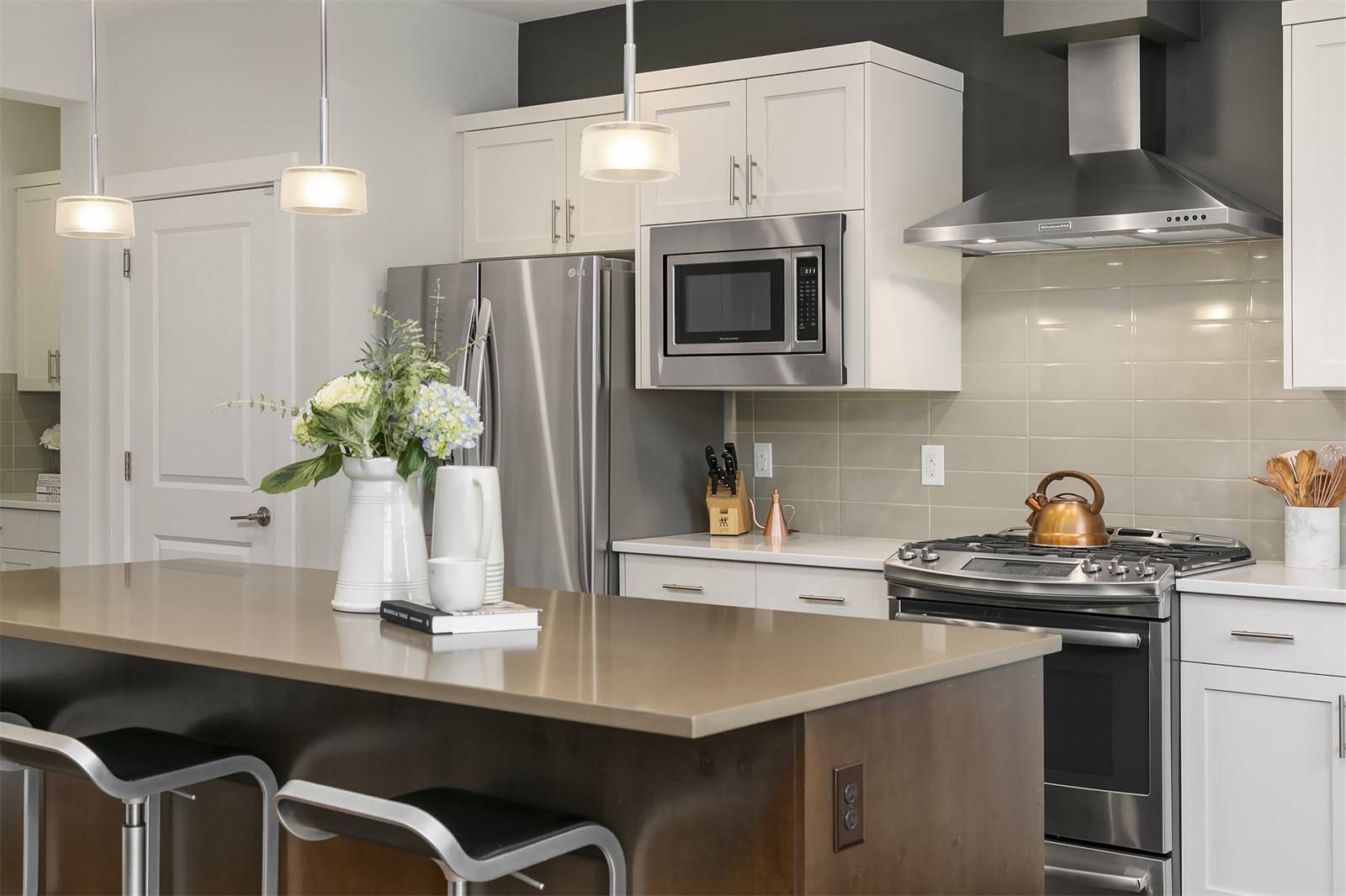
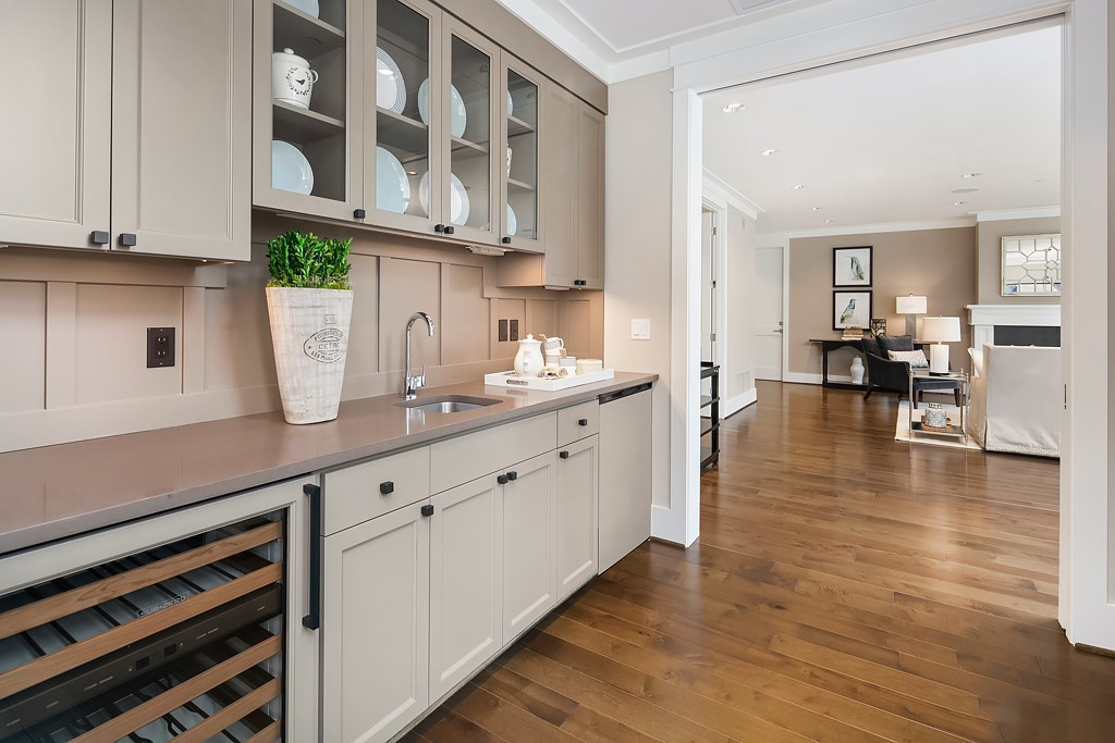
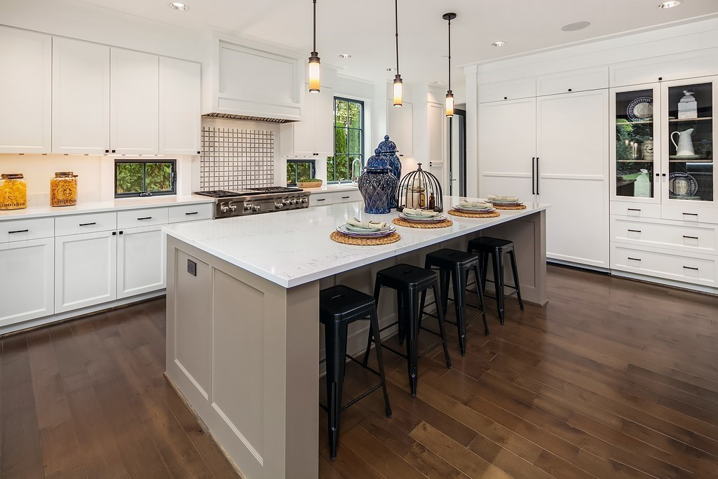
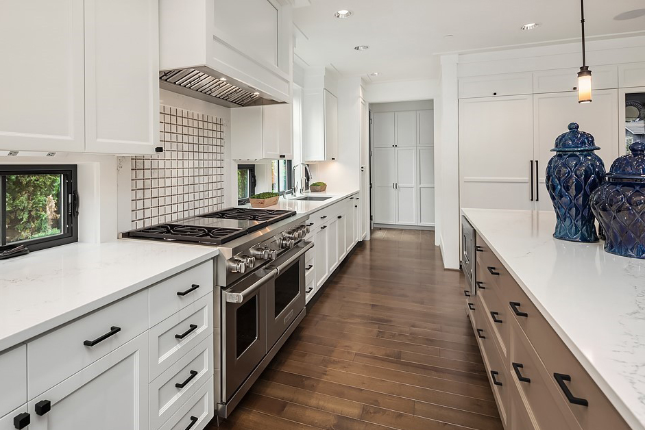
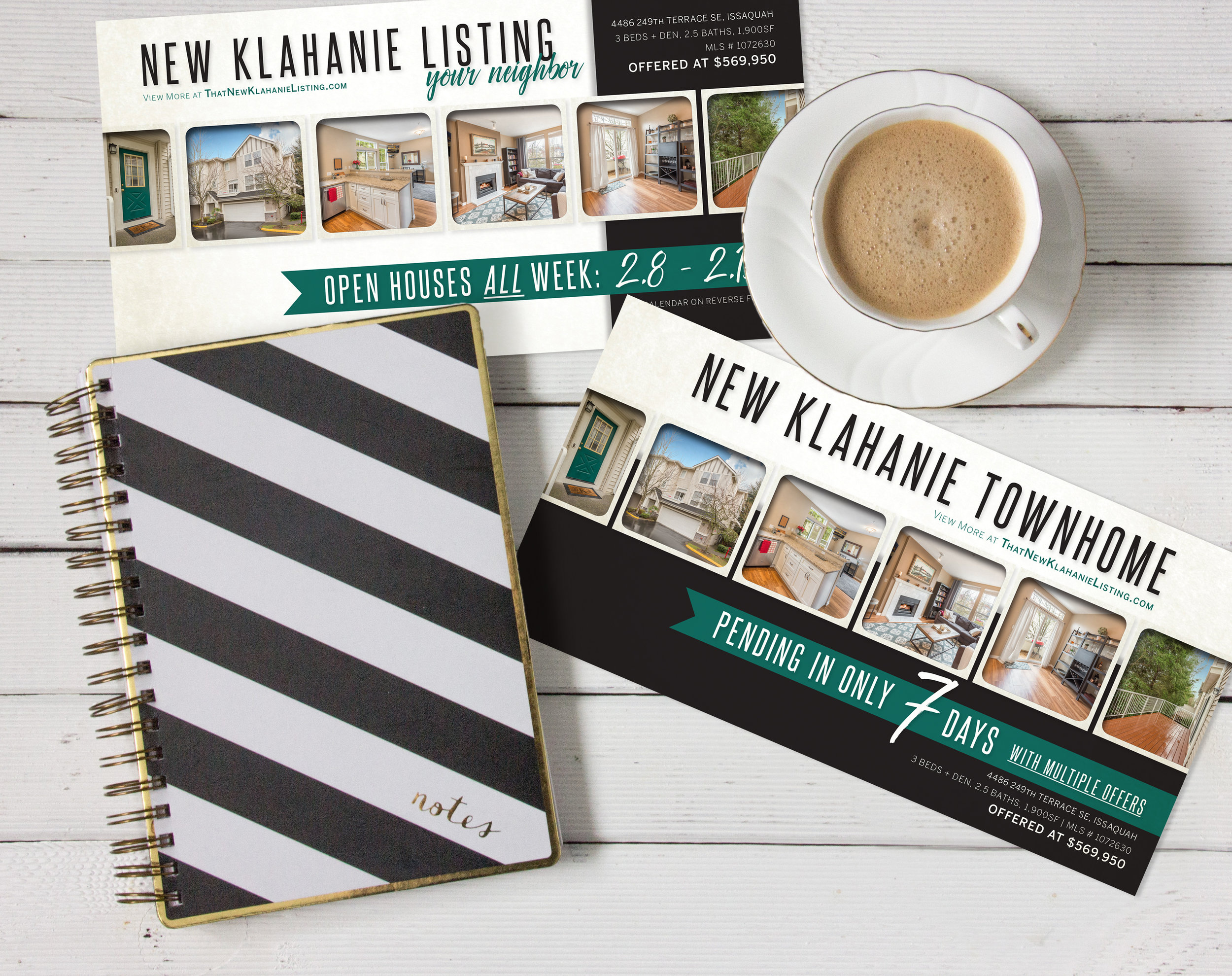
![Collateral included a custom property website [ Escala2005.com ], a brochure, an email campaign & a Just Listed postcard](https://images.squarespace-cdn.com/content/v1/583b73b3d1758efcf2b9ec89/1551469776740-WJH8V7ZYE1AM9I9G66E7/escala+2005+collateral.jpg)